
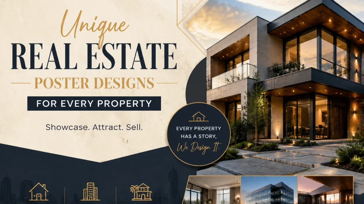
Introduction
In the competitive world of real estate, first impressions matter more than ever. A well-designed poster can instantly capture a potential buyer’s attention, communicate key property features, and create a lasting impression.
Unique real estate poster designs go beyond simply displaying photos—they tell a story, highlight the property’s best qualities, and reflect the brand’s identity. Whether you’re marketing luxury homes, commercial spaces, or cozy apartments, creative poster designs help your listings stand out in a crowded market, attract the right audience, and ultimately drive faster sales.
Using Drone Shots to Enhance Poster Visuals
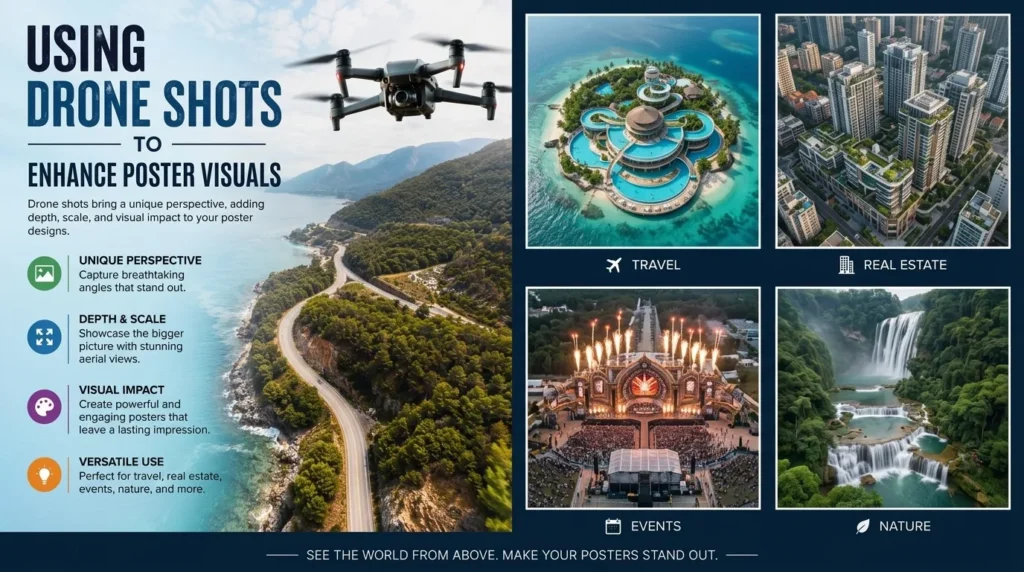
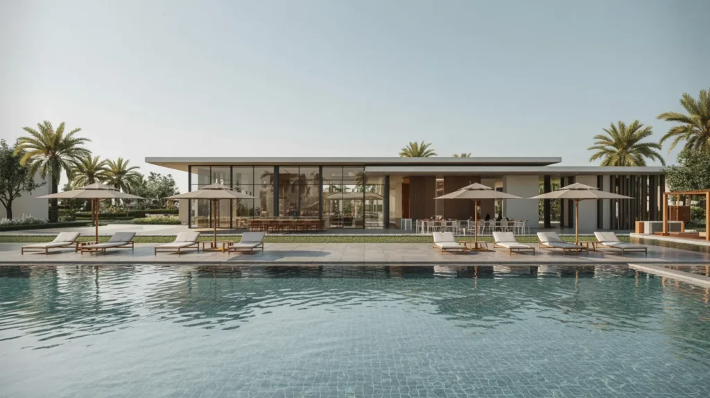
Drone photography has revolutionized real estate marketing by providing stunning aerial perspectives that traditional photography cannot capture. Incorporating drone shots into your posters allows buyers to see the full layout of a property, its surroundings, and neighborhood features, which adds a sense of scale and context.
High-quality aerial images can highlight amenities such as gardens, pools, parking spaces, or proximity to parks and landmarks. When combined with well-designed poster layouts, drone visuals create a striking and immersive experience that immediately draws attention, making your listings more memorable and increasing the likelihood of inquiries.
Posters That Tell a Property’s Story Visually
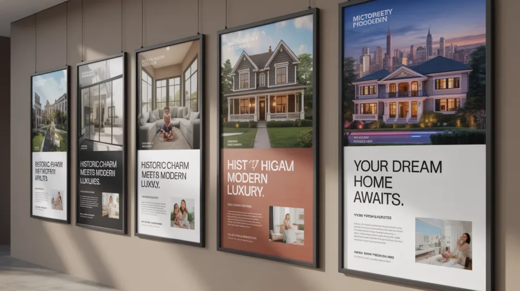
A compelling real estate poster does more than show pictures—it tells a story that helps potential buyers imagine themselves living or working in the space. By carefully selecting images, colors, and layout, you can highlight the property’s lifestyle, unique features, and atmosphere.
For example, a cozy family home can be showcased with warm tones and inviting interior shots, while a luxury condo might emphasize sleek architecture and city views. Story-driven posters connect emotionally with viewers, making the property more memorable and increasing engagement. Using sequential images or a visual flow can also guide the viewer through the property’s key spaces, giving a mini “tour” without leaving the poster.
Strategic Use of Borders and Frames in Posters
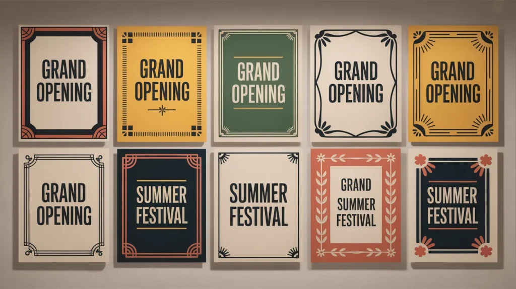
Borders and frames are subtle but powerful tools in poster design that can enhance focus and improve visual hierarchy. A well-chosen frame can draw attention to the property’s main image or highlight important information such as price, location, or contact details. Thin, minimalistic borders create a clean, modern look, while decorative or textured frames can add elegance or personality to the poster.
Strategic placement of borders also helps separate sections of information, making the poster easier to read and more visually balanced. Consistent framing across multiple posters reinforces brand identity and makes your marketing materials appear professional and cohesive.
Highlighting Investment Potential Through Design
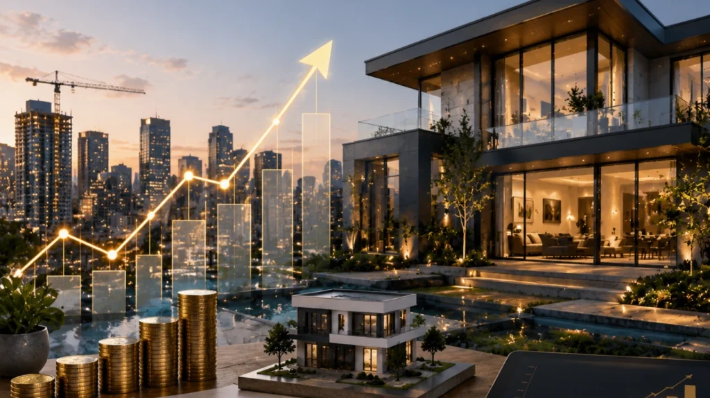
A well-designed real estate poster can do more than show a property’s aesthetic appeal—it can subtly communicate its investment potential. Using visual cues like graphs, icons, or “feature highlights” sections, you can emphasize factors such as expected rental income, growth in property value, or proximity to business hubs.
Color coding and callouts can draw attention to these key financial advantages without overwhelming the viewer. This approach not only attracts buyers looking for a home but also investors seeking profitable opportunities, making your poster a dual-purpose marketing tool that speaks to multiple audiences.
Incorporating Local Landmarks for Buyer Connection
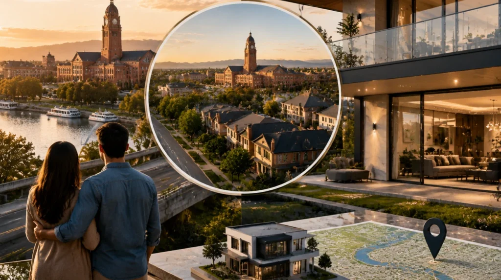
Including recognizable local landmarks in your real estate poster can instantly create a sense of connection and trust with potential buyers. Landmarks such as parks, schools, shopping centers, or iconic city structures help viewers visualize the property’s surroundings and assess the convenience of the location.
Highlighting these landmarks also conveys a sense of community and lifestyle, which can be especially persuasive for buyers relocating to the area. Strategically placing images or subtle icons of local landmarks within the poster design reinforces context while keeping the overall layout clean and appealing.
Designing Posters for Short-Term vs. Long-Term Rentals
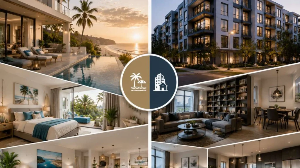
When creating real estate posters, the target rental type greatly influences the design approach. For short-term rentals, the poster should emphasize convenience, amenities, and visual appeal that attracts travelers or temporary residents. Bright, vibrant colors, lifestyle imagery, and quick-reference details like nightly rates or proximity to attractions work best.
For long-term rentals, the focus shifts to stability, community, and investment value. Clear layouts, professional photography, and detailed information on lease terms or neighborhood benefits appeal more to long-term tenants. Tailoring the design to the rental type ensures that your poster resonates with the right audience and drives faster inquiries.
Effective Use of Contrast to Emphasize Key Details
Contrast is a critical design principle that directs a viewer’s attention to the most important parts of a poster. By using contrasting colors, font weights, or sizes, you can make essential details like property price, location, or call-to-action stand out immediately.
For example, a bold heading on a light background instantly captures attention, while subtle contrasts between sections help organize information clearly. Contrast not only improves readability but also creates visual interest, ensuring that viewers engage with your poster and remember key details about the property.
Poster Templates That Save Time Without Losing Style
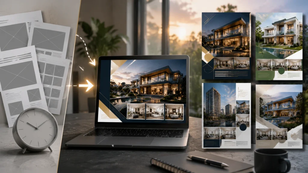
Using pre-designed poster templates can significantly streamline your real estate marketing process while maintaining a professional and stylish appearance. Templates provide a structured layout where you can easily insert property photos, details, and branding elements without starting from scratch.
The key is to choose templates that are customizable, allowing adjustments in colors, fonts, and imagery to match your brand identity and the property’s unique character. By leveraging templates strategically, you save time on design, maintain consistency across multiple listings, and still produce eye-catching posters that attract potential buyers.
Combining Vintage and Modern Design Elements
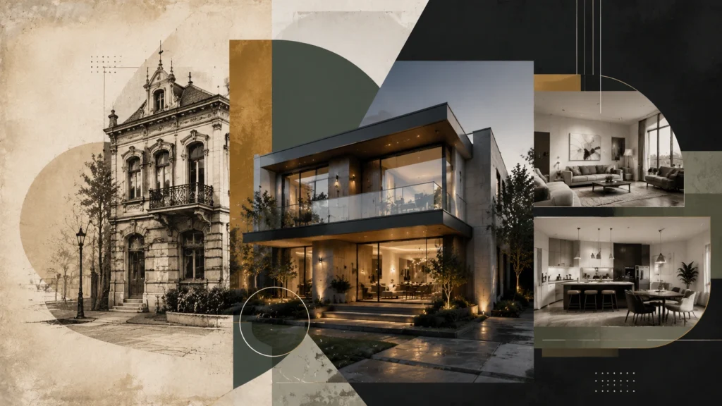
Mixing vintage and modern design elements creates a unique visual style that can make your real estate posters stand out. Modern minimalism—clean lines, bold typography, and sleek layouts—paired with vintage touches such as textures, retro fonts, or subtle patterns, adds personality and sophistication.
This combination can evoke nostalgia while presenting the property in a contemporary, appealing way. Using this approach thoughtfully helps your posters catch the eye of diverse audiences, making listings memorable and enhancing the overall perception of your brand.
Making Posters Stand Out in Crowded Markets
In a competitive real estate market, your poster needs to capture attention instantly. Bold visuals, striking colors, and a clear hierarchy of information help your poster rise above the noise. Using unique layouts, high-quality images, and creative elements like overlays or icons can make your design memorable.
Additionally, tailoring content to the target audience—whether first-time buyers, investors, or luxury clients—ensures relevance. By combining creativity with strategic messaging, your poster can leave a lasting impression, increase inquiries, and give your listings a competitive edge.
Visual Tricks to Make Spaces Appear Larger
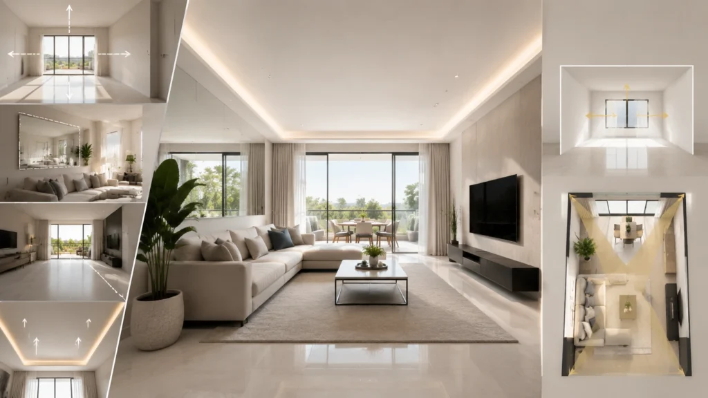
Effective poster design can influence how potential buyers perceive a property’s size. Techniques such as wide-angle photography, high vantage points, and well-lit interiors create the illusion of spaciousness. Incorporating mirrors or reflective surfaces in visuals, as well as using light, neutral colors in images and backgrounds, further enhances this effect.
Strategically cropping or framing images to highlight open areas can make rooms feel more expansive. By applying these visual tricks, your poster not only looks professional but also helps buyers imagine themselves comfortably living or working in the space.
Using Infused Brand Colors for Recognition
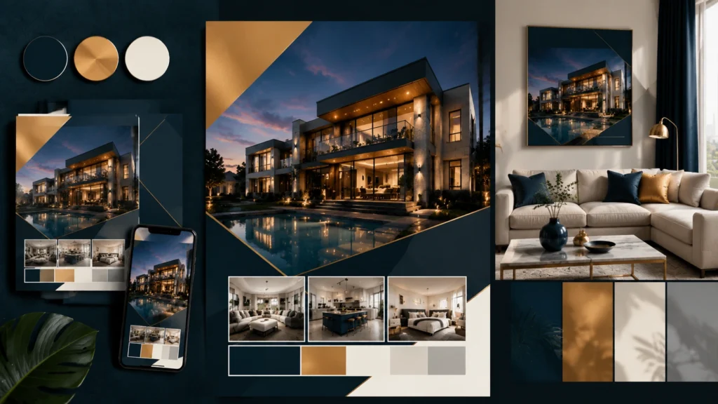
Incorporating your brand’s signature colors into real estate posters helps create instant recognition and strengthens brand identity. Consistent use of color across all marketing materials—from posters to social media graphics—ensures your listings are easily associated with your business.
Beyond branding, colors can also convey emotion and highlight specific property features. For example, warm tones can create a welcoming atmosphere, while bold colors can draw attention to key details like price or location. Thoughtful integration of brand colors makes your posters visually cohesive, professional, and memorable.
Crafting Posters That Align with Social Media Ads
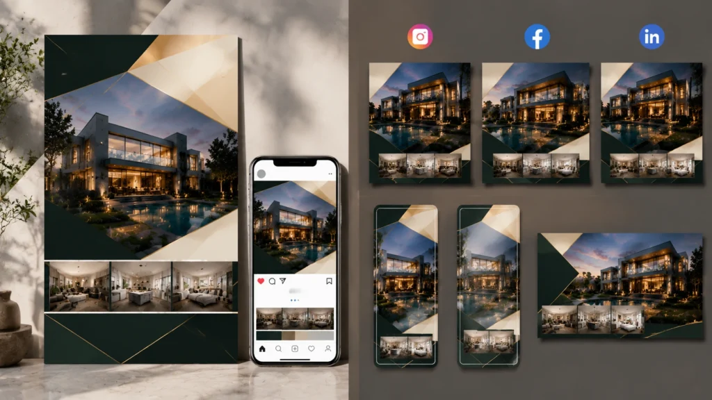
Designing real estate posters to align with social media campaigns enhances marketing effectiveness and reach. By maintaining consistent visuals, typography, and messaging across posters and digital ads, you create a seamless brand experience for potential buyers.
Optimizing poster dimensions and formats for both print and social media platforms ensures your content looks professional everywhere it’s displayed. Additionally, including shareable elements like hashtags, QR codes, or clickable links bridges offline and online marketing, increasing engagement and driving more inquiries. Cohesive poster designs amplify the impact of your overall marketing strategy.
Placement of Contact Info for Maximum Conversions
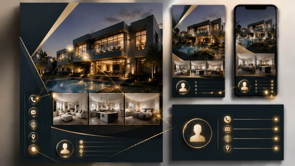
The placement of contact information on a real estate poster can significantly influence how quickly potential buyers respond. Contact details should be clearly visible, easy to read, and positioned where the eye naturally rests—typically near the bottom or in a highlighted section. Using contrasting colors or boxes to separate contact info ensures it doesn’t get lost among images or other details.
Including multiple contact methods, such as phone, email, and website, caters to different preferences, increasing the likelihood of inquiries. Strategic placement makes it simple for interested buyers to take immediate action.
Designing Posters for International Buyers
When targeting international buyers, real estate posters should combine clear visuals with universally understandable elements. Use high-quality images that showcase the property and its surroundings, avoiding culturally specific symbols that might confuse foreign audiences. Include measurements in both metric and imperial units and provide key information like nearby schools, transport links, and local amenities.
Using neutral, professional design elements and concise text ensures your poster appeals across different cultures and languages, making it easier for international clients to assess the property and feel confident in their decision.
Showcasing Amenities Without Overcrowding
Highlighting property amenities is essential, but overcrowding a poster with too many details can overwhelm viewers. Prioritize key features that appeal most to your target audience, such as pools, gyms, parking, or outdoor spaces. Use icons, small infographics, or dedicated sections to present amenities clearly and attractively.
Proper spacing, minimal text, and visual cues help viewers quickly understand the benefits without distraction. This balance ensures your poster remains clean, professional, and effective at communicating the property’s unique offerings.
Integrating Maps and Floor Plans Effectively
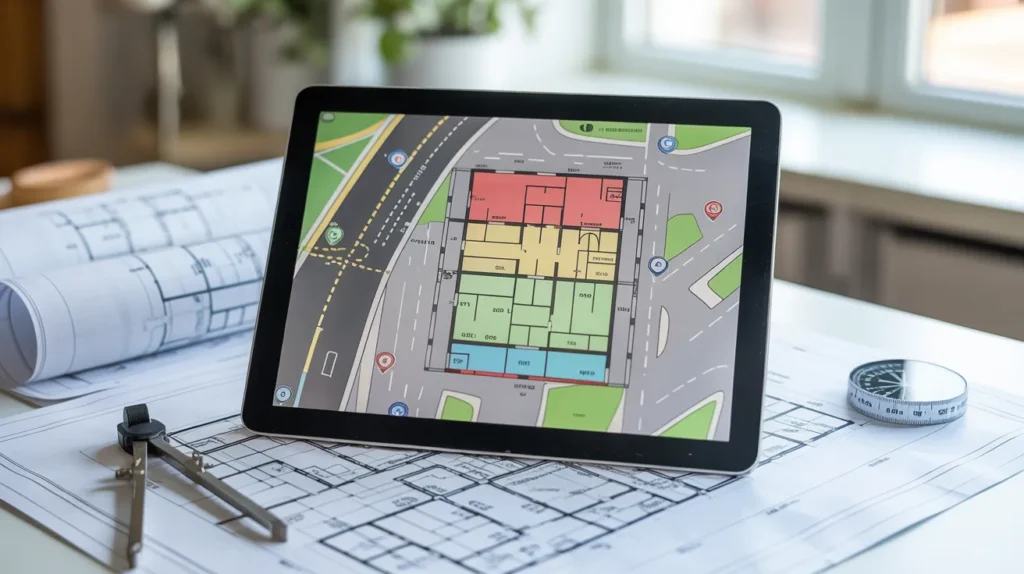
Including maps and floor plans on real estate posters helps buyers quickly understand a property’s layout and location. Maps should highlight the property’s proximity to key amenities like schools, shopping areas, and transportation hubs, giving a sense of convenience and neighborhood appeal.
Floor plans should be clean, labeled, and easy to read, emphasizing room sizes and flow. Using simplified icons or color coding can make complex layouts easier to interpret. When integrated thoughtfully, maps and floor plans provide valuable context, build trust, and enhance the overall usefulness of the poster.
Posters That Evoke Emotion and Aspirations
Great real estate posters do more than show a building—they make buyers imagine a lifestyle. By using warm imagery, inviting lighting, and aspirational visuals, posters can evoke emotions like comfort, luxury, or community. Including lifestyle elements such as family gatherings, cozy interiors, or scenic views helps viewers connect personally with the property.
Emotional engagement encourages buyers to envision themselves living or investing there, making the listing more memorable. Posters that appeal to aspirations not only attract attention but also increase the likelihood of inquiries and conversions.
Testing Different Poster Styles for Market Feedback
A/B testing various poster styles allows you to understand which designs resonate best with your target audience. Try experimenting with different colors, layouts, image placements, and fonts to see which versions generate the most inquiries or engagement.
Collect feedback from both potential buyers and your sales team to identify effective visual elements and messaging. Testing not only improves the performance of individual posters but also provides insights for future campaigns, helping you refine your overall marketing strategy and maximize ROI.
Eco-Friendly Materials for Sustainable Real Estate Posters
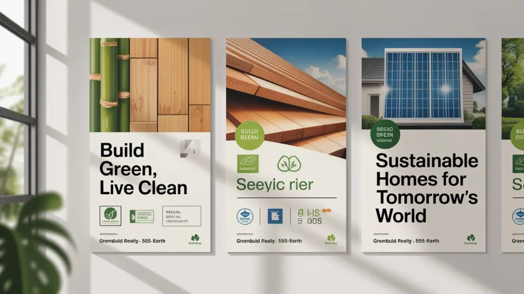
Sustainability is becoming an important consideration for many buyers, and using eco-friendly materials in your posters can reflect positively on your brand. Printing on recycled paper, using water-based inks, or opting for digital posters reduces environmental impact while maintaining professional quality.
Highlighting your commitment to sustainability can also appeal to environmentally conscious buyers, creating an additional selling point. By combining eco-friendly choices with creative design, your posters remain impactful while aligning with modern values and responsible business practices.
Final Thoughts
Unique real estate poster designs are more than just visuals—they are powerful marketing tools that can attract buyers, convey property value, and elevate your brand. By combining creativity, strategic design elements, and audience-focused messaging, you can make your listings stand out in any market. From typography and imagery to layout, color, and sustainability, every detail matters.
Investing time and thought into your posters not only captures attention but also builds trust, inspires action, and ultimately drives faster sales. Use these ideas as a guide to create posters that are memorable, effective, and perfectly aligned with your real estate goals.